

Few football clubs have a kit connection as strong as Rangers. Their royal blue, white, and red look isn’t just a patternit’s a sign of who they are, going back further than most clubs’ traditions. Rangers fans don’t just put on the shirt; they wear it as proof of belonging to a story that started in 1872.
The thing is, that deep sense of identity influences how their kits are made, accepted, and recalled over time. The designs that fans remember best aren’t always the most advanced or well-engineered ones. They’re the ones that reflect what the club stood for at a certain time and kept that spirit intact.
You probably have to look at how the visual style of Rangers shirts changed over the years to understand why some designs still stand out today. There’s more to it than just colors or patternssome choices tend to feel like a true match for the club’s soul.
The Adidas Years and the Foundation of Modern Rangers Identity
The years from the late 1970s to the 1980s had the biggest influence on how modern Rangers fans see their team uniforms. Adidas made the shirts that a lot of fans grew up with, and that helped shape how people viewed the club’s look. Their style included triple stripes on the sleeves, clean badge placement, and fabric that felt right for the time. These details became what fans expect now, even today.
Shirts from 1978 to 1984 are some of the most wanted in Scotland’s football collectibles market. The deep royal blue used then had a richness newer versions can’t quite copy. The build quality meant these shirts lasted for years without breaking down as cheaper ones do. For those who wore them as kids in the early ’80s, the emotional value is hard to ignore. It seems no current kit can replace that feeling, no matter how well-designed it is. At least in theory, these old shirts hold a unique place in fan memory.
The Nine-in-a-Row Era and Shirts That Carried History
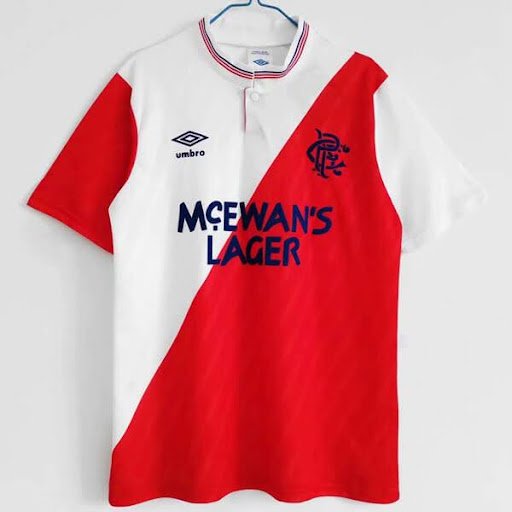
The time between 1989 and 1997, when Rangers secured nine straight Scottish league titles, remains the most successful period in the club’s modern pastthough at least in theory, the actual impact on fan culture might be different. The jerseys from that stretch hold strong value because they represent a key moment in team history. Several companies made shirts during those years, and McEwan’s beer was the sponsor starting in 1987 and stayed through 1999. That long-term partnership gave the kits a consistent look even as designs changed, helping collectors recognize them quickly.
Umbro’s early 1990s kits are often praised by fans and collectors. The home jersey from 1992 to 1994, with its subtle stripe and clear placement of McEwan’s logo, is widely seen as one of the best Rangers shirts ever made. This style manages to reflect its time while also holding up well over the decades. Its appearance feels authentic to the era without fading into outdated looks.
What Makes Rangers Blue So Difficult to Get Right
Rangers’ specific royal blue is hard to match exactly, and this has shaped how collectors view the team’s shirt through different years. Those familiar with the club’s kit can spot when a shirt was made by reading the exact shade of blue used. Some versions appear too vivid, others too deep, and only a few hit the correct tone with clear visual power.
The team’s identity depends heavily on how the kit looks, not just that it’s blue. While other clubs use blue, the Rangers’ version has a distinct feel that fans notice right away. When brands like Adidas made the shirts properly during their top partnership periods, fans felt the shirts truly reflected the team’s spirit. If the blue is even slightly off, fans who couldn’t explain it still sense something is wrong.
The shirts from those times have strong recognition value because of their accuracy.
The Role of European Nights in Cementing Kit Memories
Rangers’ history in Europe has given certain shirts a solid sense of meaning that domestic games never could. During the 1992-93 Champions League, Rangers stayed unbeaten through the group stage and narrowly missed making it to the finalthis makes the shirts from those matches especially meaningful. The Umbro home shirt from that season holds real value for fans who attended those European matches at Ibrox.
European football creates a stronger memory for Scottish supporters because these chances happen less often than in bigger leagues. When Rangers played against Leeds United, Marseille, or CSKA Moscow, the games felt more important due to the unfamiliar opponents. A Rangers jersey worn in those 1992-93 matches carries a clear connection to those nights. And supporters who saw those games can’t separate the experience from the actual shirt.
For collectors looking to explore this history through the shirts themselves, specialist sources for retro Rangers shirts provide properly authenticated pieces from across these key eras, a more reliable route than general marketplace platforms where provenance claims are frequently optimistic and condition descriptions rarely match reality.
How Modern Rangers Kits Navigate the Weight of History
Rangers’ current kit choices face strong expectations from fans who deeply understand the club’s past and demand high standards in new releases. Going back to Adidas in 2020 after earlier partnerships was seen as a positive step, mainly because it showed good quality and reminded fans of a long-standing link with the brand.
Todays Rangers shirts work best when they respect the look from the team’s most successful times without making exact copies. The right royal blue color, a clear badge, and simple design details are what fans value most. If new versions move too far from these basicslike using bold colors, messy patterns, or heavy brandingfans who know the history react quickly and do not offer much tolerance.