

The way people surf the internet has totally shifted. Ten years ago, they would view websites on their desktops. Today, the majority of website traffic in the UK – and worldwide – is from smartphones and tablets. That has completely transformed how businesses must approach designing websites.
Having a mobile-friendly website is no longer optional. It’s something that any business that wishes to remain competitive, attract customers, and establish online trust needs to have. In fact, your mobile experience on your site can literally make or break whether or not visitors will trust you or bounce in seconds.
Here at Berks Technologies, we offer custom web design solutions that make your site look and function beautifully on any platform.
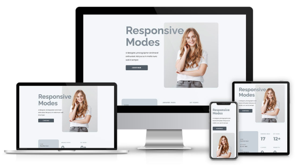
What Is Mobile-Friendly Website Design?
A mobile site is a site that automatically adjusts to fit all screen sizes, from desktop to laptop, tablet, or smartphone. This is a responsive design.
Rather than building two sites, one for mobile and one for desktop, responsive design employs flexible layouts, scalable graphics, and adaptive elements to build an uninterrupted experience on varying devices.
For instance:
- On a large screen, a navigation menu may be displayed top-to-bottom.
- On a phone, the same menu becomes an icon for a “dropdown” or “hamburger.”
The outcome? Users can easily access your site regardless of the device.
Why Mobile Design Is Important
Now, let’s explore why mobile design is important for any business:
-
Most Users Are Mobile
More than 70% of UK adults access the internet mostly through mobile phones. What this implies is that unless your website is mobile-optimised, you stand to lose nearly all your users.
-
Google Prefers Mobile-Friendly Sites
Google itself has been applying mobile-first indexing from 2019 onwards, i.e., indexing sites according to their mobile version. If your website isn’t mobile-friendly, it will not rank well on search engines – preventing potential customers from discovering you.
-
First Impressions Build or Break Trust
A site that appears cluttered or broken on mobile makes visitors think that your company is old-fashioned or amateurish. Conversely, a clean, responsive design indicates that you respect the user experience and are detail-oriented.
-
Enhanced User Experience
Users prefer sites to be fast and function on their phones. If they cannot zoom, tap buttons quickly, or scroll quickly, they will leave you. A mobile-friendly design creates happy users and makes them more likely to convert.
-
More Conversions and Sales
Research has shown that mobile-friendly websites have higher conversion rates as users are able to perform actions – like buying or filling a contact form – without frustration. For businesses online, this can translate automatically to more revenue.
Cons of Not Having a Mobile-Friendly Site
Ignoring mobile optimisation will most likely kill your business. These are the significant cons:
- High Bounce Rates: Users abandon websites that are not responsive on mobile.
- Lost Sales: If payment gateways or checkout forms are difficult to navigate on a phone, the customer will not complete the purchase.
- Poor SEO Rankings: Sites that are unresponsive find it difficult to rank on Google’s page one.
- Damaged Brand Image: A bad mobile site gives the perception that your business is outdated or unsafe.
- Competitive Disadvantage: And if competitors do have a responsive site, they will be the ones who will win back your lost customers.
Major Aspects of Mobile-Friendly Website Design
Making a mobile site is more than compressing the text. It’s a process that requires planning and building. The most critical things are:
- Responsive Layouts
Your page must respond nicely to varying screen sizes and maintain the content in a readable and accessible manner.
- Fast Loading Speeds
Mobile users will probably be in a hurry. Minifying, compressing, and optimising hosting can get your site under a 3-second load time.
- Touch Navigation
Buttons, menus, and links should be big enough to tap easily. Nobody wants to pinch-zoom their phone so they can click a link.
- Readable Text
Text must be large and readable enough that people are able to read it on small screens without having to zoom.
- Optimised Images and Media
Images must resize well to small screens without bogging down load time.
- Basic Forms
Contact forms, sign-ups, and checkouts must be short, readable, and easy to fill out on a phone.
- Mobile-First Testing
A site must be tested on various devices and browsers beforehand to make sure it runs smoothly everywhere.
Mobile-Friendly Design Across Industries
Every business is different, but every business requires a mobile-friendly design.
- Retail & E-commerce: Users can browse and buy from their smartphones, boosting sales.
- Healthcare: Users can book an appointment or find resources easily.
- Hospitality: Faster mobile reservation processes are facilitated by restaurants and hotels.
- Professional Services: A mobile-optimised contact page or portfolio builds client trust.
- Education: User-friendly online learning environments are required on all devices to be accessible.
Regardless of your business or industry, your customers want seamless mobile experiences.
Cost of Developing Mobile-Friendly Sites
Web development for a mobile-friendly site depends on complexity, functionality, and whether you use a template or custom web design services.
- Template Sites: Low-cost but less versatile. Suitable for small businesses.
- Custom Sites: Built to exactly fit your brand and user requirements. Although costly, they are more suited to performance, security, and scalability.
The minimum for UK companies for a basic responsive site is £2,000–£4,000. More sophisticated sites with e-commerce, booking systems, or integrations cost between £7,000 and £15,000 or more.
The key thing to keep in mind here is that this isn’t an expense – this is an investment in trust, transparency, and long-term growth.
The Competitive Edge of Custom Web Design Solutions
Berks Technologies provides custom web design solutions that meet your business objectives. Generic templates cannot compare with our custom solutions, which guarantee:
- A design that showcases your brand identity.
- Scalability for growing your business.
- Security tools that safeguard your customers.
- Smooth integration with tools you already employ.
- A unique competitive edge over generic business site cookie-cutters.
Our solution combines design uniqueness with technical accuracy so that not only does your site appear professional, but it also inspires enduring trust.
How Mobile Design Inspires Trust
Let’s link mobile design with customer trust:
- Consistency: A responsive site provides the same brand experience anywhere.
- Reliability: Glitch-free performance indicates you care about quality.
- Accessibility: Customers can interact with your business anywhere, anytime.
- Transparency: Clear designs place contact details, services, and policies in easy view.
- Professionalism: A tidy, up-to-date mobile site demonstrates that you care about your business.
In short, a mobile-friendly website ensures customers feel confident that you’re a reputable and modern business.
Partner with Berks Technologies
Your site is the foundation of your web presence. At Berks Technologies, we know that no two companies are the same, nor are their customers. Therefore, we don’t believe in you taking a one-size-fits-all approach.
With our bespoke web design packages, we assist UK businesses in designing websites that are quick, secure, responsive, and trustworthy. If you are a new business wanting to build credibility or an expanding business wishing to increase conversions, we ensure your site is built to deliver at its best.